GameStop has gone dark.
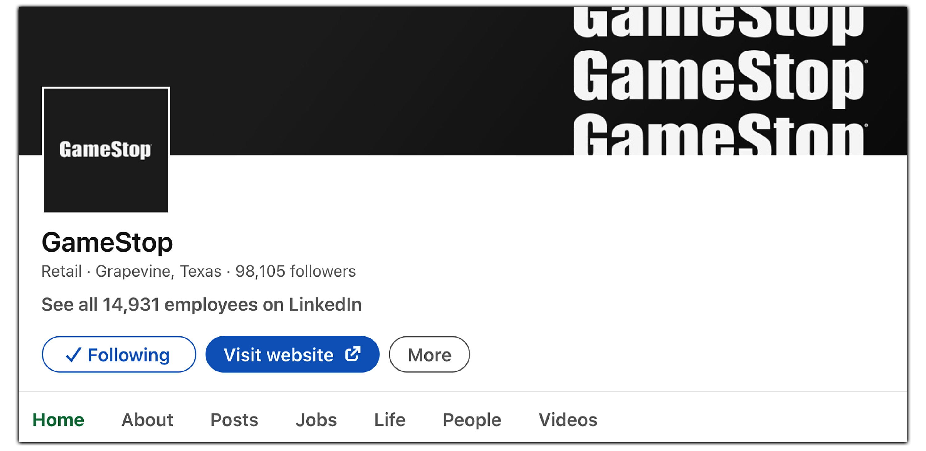
GMEdd.com has made it clear – LinkedIn is the place to see what GameStop is up to. In the midst of one of the “biggest transformations in history,” GameStop has refreshed their corporate branding alongside their corporate governance.
While other innovative companies opt for inviting colors, GameStop has gone bold – a sleek Black and White.
The company appears to believe their name says it all.
The gaming retailer’s consumer-facing branding has not changed at all; the signature bright red is still present on GameStop’s Twitter and Facebook profiles.
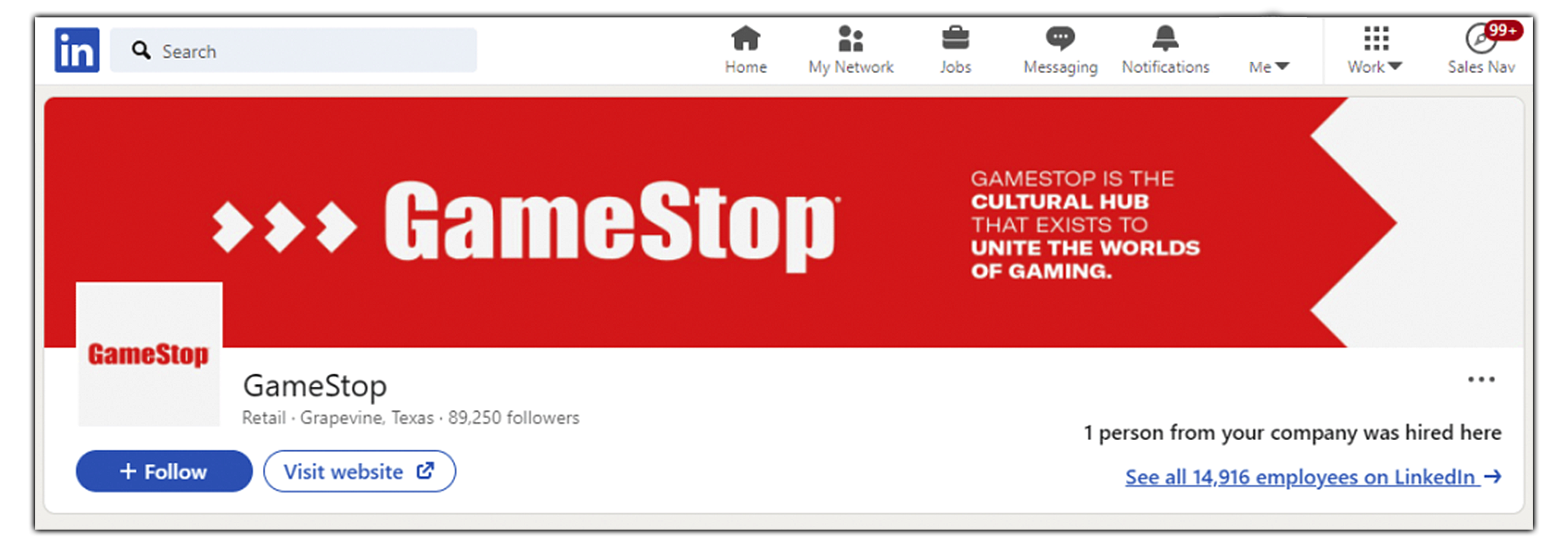
GameStop’s LinkedIn prior to today, displaying the slogan under George Sherman
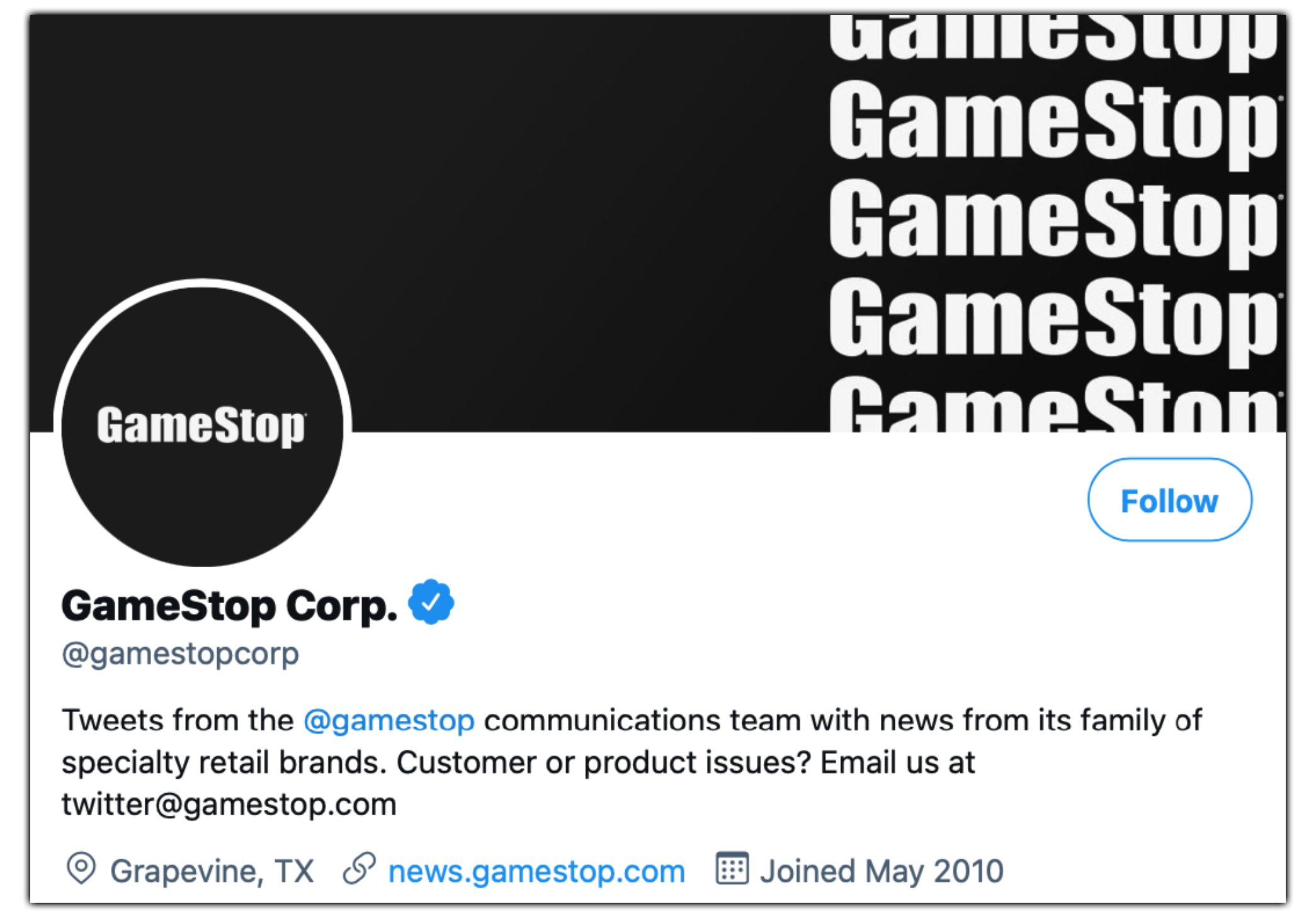
GameStop’s Corporate Twitter also displays the refreshed branding, with the same header and icon as LinkedIn.
These brash differences between GameStop Corp. and GameStop the retailer seem to imply that GameStop intends on being much more than a gaming store, with possible divisions existing under the corporate hold.
Some speculate that the corporate branding change may solely be in recognition of Juneteenth, a United States federal holiday made famous by President Trump that commemorates the end of slavery.
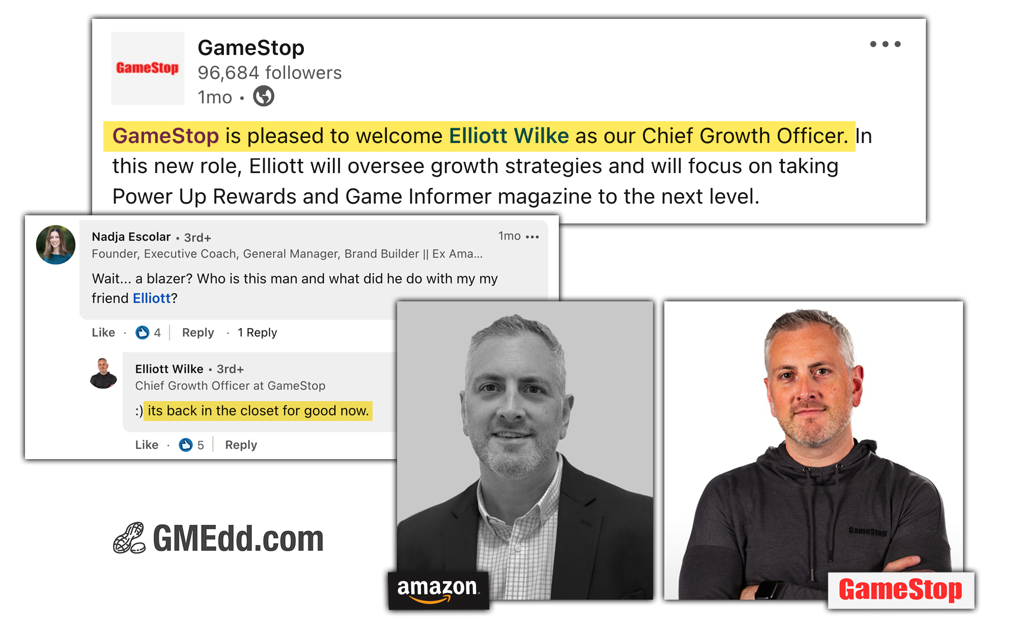
While this is possible, it seems more likely to not be the case because GameStop does not have a past of recognizing holidays this way. Elliot Wilke, GameStop’s Chief Growth Officer, has also shown off a sweet black on black GameStop Corp. hoodie in the past, foreshadowing this sleek rebrand.
